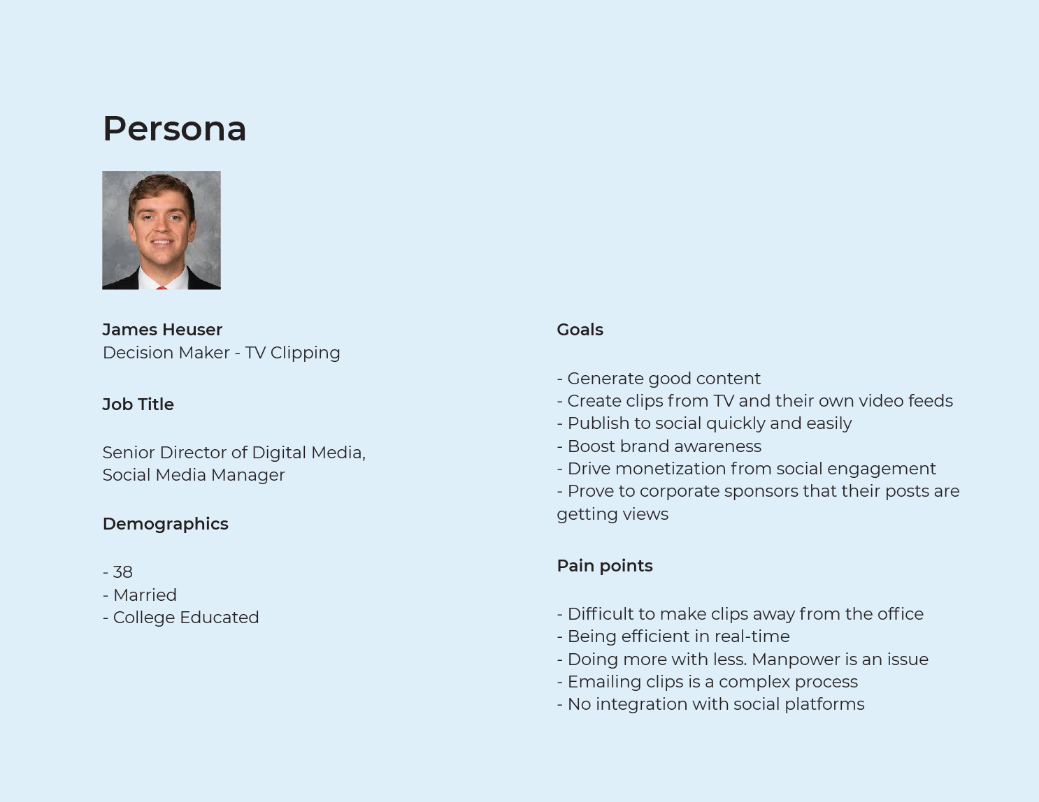
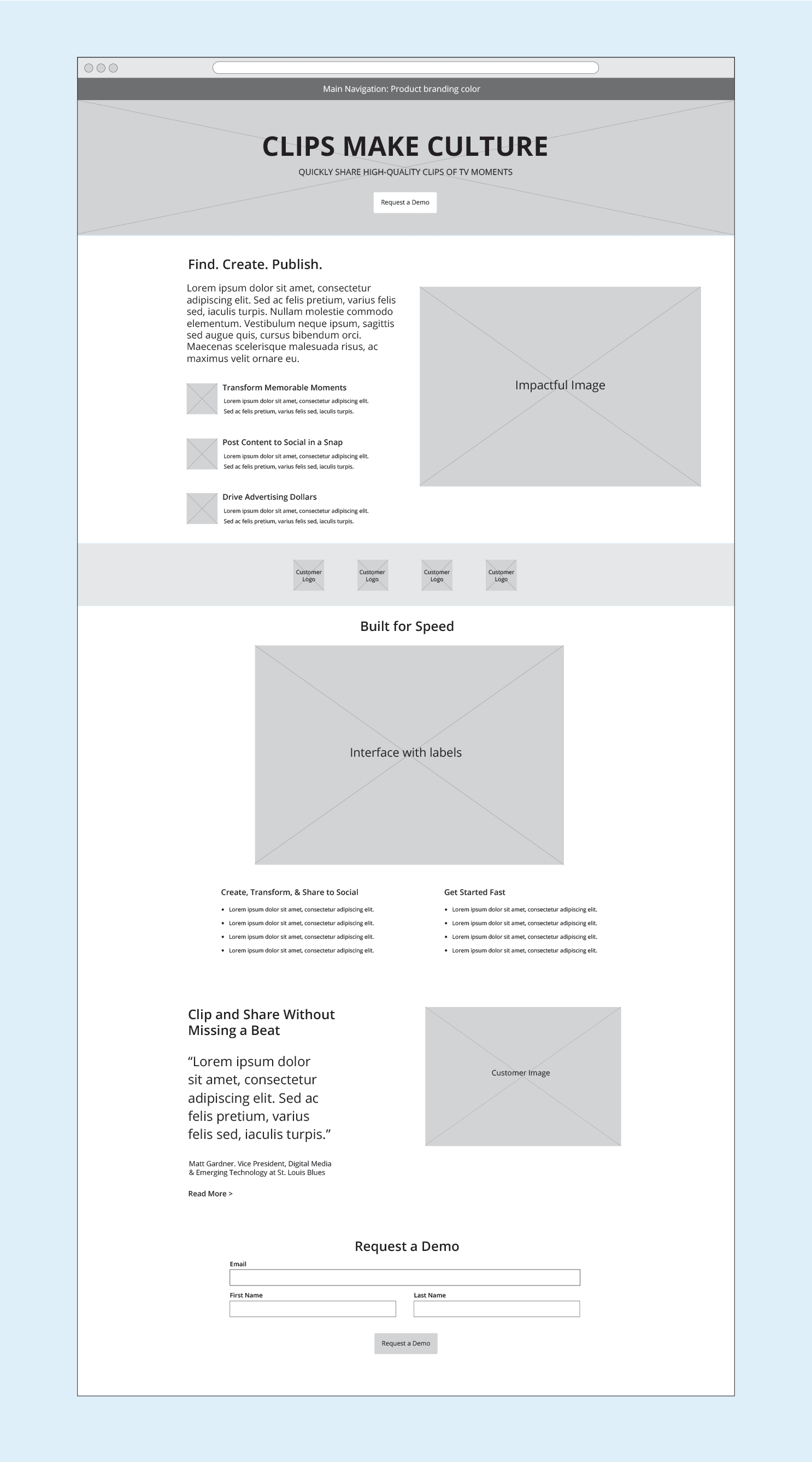
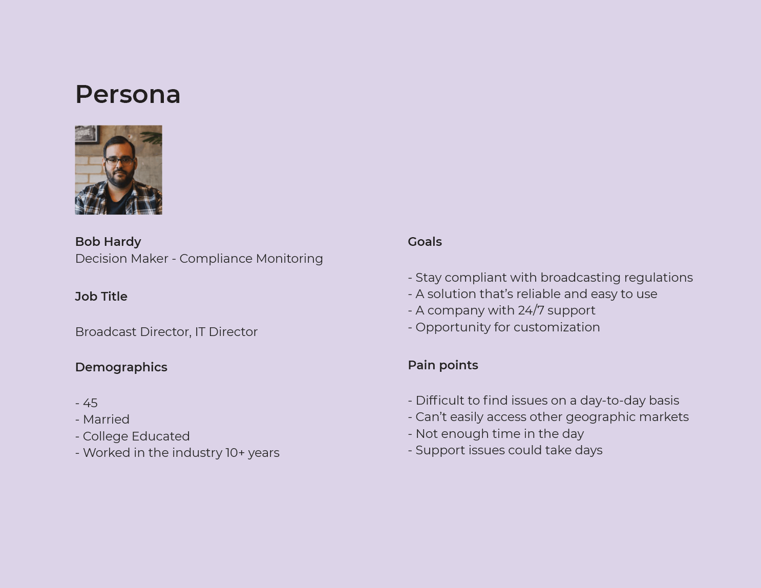
The company, which creates software for organizations to monitor TV and create clips, wanted to transition its website away from features-driven content and focus on user benefits-driven content. I listened to real customers, which allowed me to develop distinct personas for potential customers in each market. I designed the pages to highlight each persona's unique needs and answer any questions they have when evaluating their next solution. Working alongside the copywriter, I structured the content on each page so that it addressed the main pain points at the top, followed by social proof, detailed images of the interface, and finally, a quote from a customer. After user testing, the new pages went live. The results? An increase in lead conversion by 3%.
Project Type: Enterprise
Designed for: Desktop and Mobile
Stakeholders: 3
UX Designer: 1 (me)
My role was discovery, concept design, testing, and presenting to stakeholders and prospective clients.

I worked with the Director of Marketing discussing the requirements, key attributes, and goals of the project. I also interviewed current customers including The Arizona Coyotes and The Washington Capitals.


I structured the content on each page so that it addressed the main pain points at the top, followed by social proof, detailed images of the interface, and finally, a quote from a customer.

Similar to the revamped clipping page, I structured the content so that it addressed the main pain points at the top. For this use case, I incorporated a slideshow to showcase the multiple interfaces inside the product.

Once user testing was complete, the new pages were pushed live. After several weeks, lead conversion increased by 3%.
The company, which creates software for organizations to monitor TV and create clips, wanted to transition away from a website that led with features to a more user benefits-driven strategy. We listened to real customers, which allowed us to develop distinct personas for potential customers in each market. The pages are designed to highlight each persona's unique needs and answer any questions they have when evaluating their next solution. The content was structured by answering the main pain points at the top, followed by social proof, detailed images of the interface, and finally, a quote from a customer. After user testing, the new pages were pushed live. The results were an increase in lead conversion by 3%.
April 2020
by Joel Gabiola
UX/UI, Website